

Plenty of law firm websites look expensive and still make it hard to work out what the firm does.
That’s why the best law firm website design tips aren’t about adding another animation or swapping one shade of blue for another. They’re about helping the right person find the right service, trust the firm and make contact without fighting the website.
Someone arrives and still can’t work out whether the firm handles their matter, where it works or what will happen after they call. A nicer font won’t fix that.
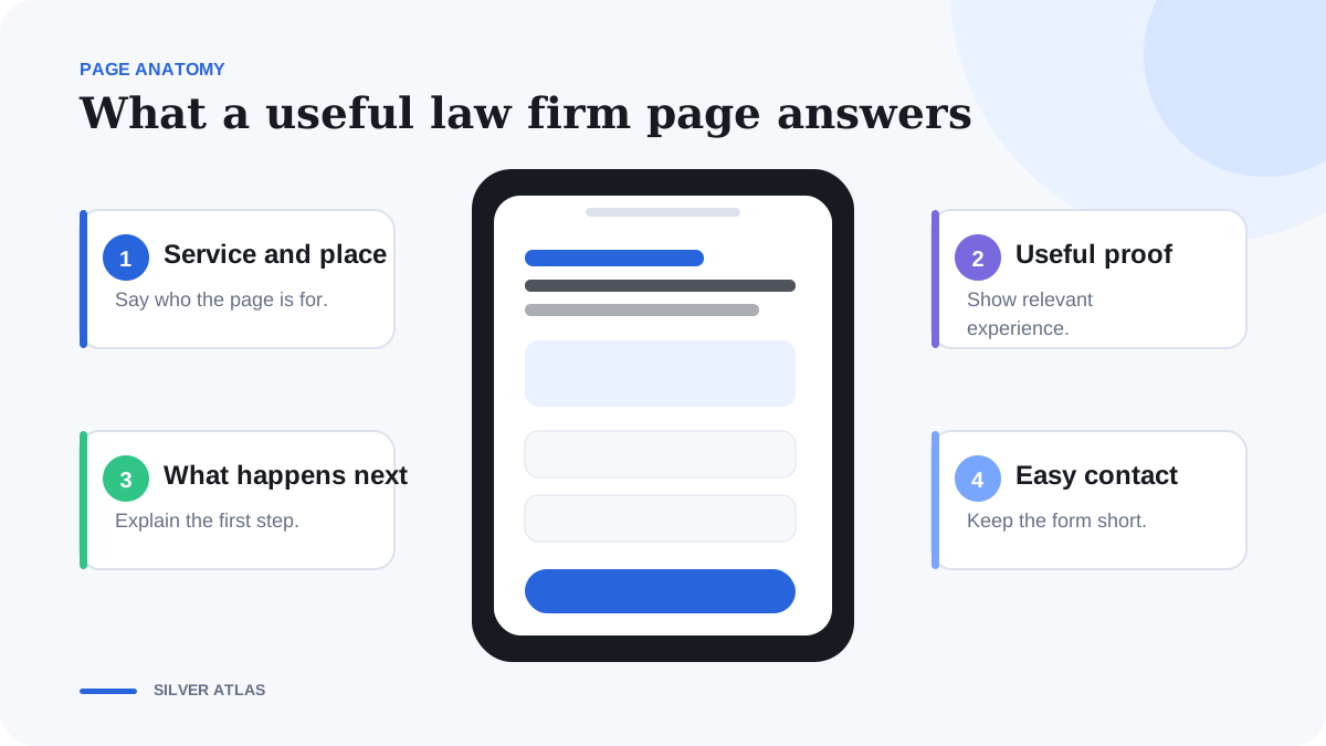
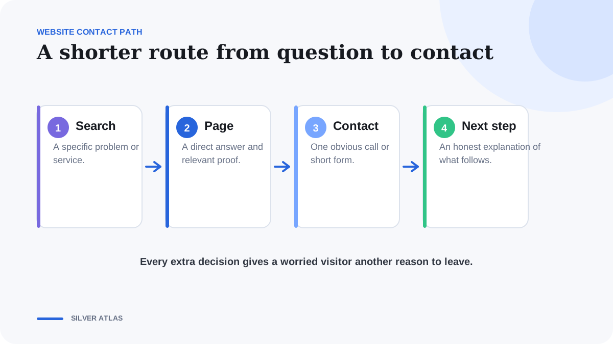
Good law firm website design answers 4 questions fast: am I in the right place, does this firm handle my situation, can I trust it and how do I make contact?
The short version
- Send important search intents to specific service pages, not a generic homepage.
- Explain fit, exclusions and the consultation process before asking for contact.
- Use verified proof with context and jurisdictional approval.
- Test the full call and form journey on a small phone.
- Improve pages from intake outcomes, not page views alone.
1. Give every page 1 job
The homepage introduces the firm. It shouldn’t also try to rank for divorce, DUI, immigration and every city the partners can drive to. A practice-area page explains one group of related matters. A narrower service page answers a distinct search such as child custody, DUI defense or business immigration. A guide answers an informational question and links to a service only when that is a useful next step.
Write the task at the top of the brief: “Help a person searching for this service decide whether to request a consultation.” If a section doesn’t help recognition, evaluation or action, reconsider whether it belongs on the page.
Don’t cram every service onto 1 page
A family law visitor and an employment law visitor shouldn’t have to decode the same generic paragraph. Separate pages when the search intent, qualification rules, proof or consultation step is meaningfully different. Keep related pages connected through a logical law firm marketing hub and descriptive internal links.
2. Answer the obvious question first
Put the service, location and next step in the first screen. Skip the rotating slogans and the paragraph about being committed to excellence. Nobody came to the site looking for that. The visitor should see the service and location without scrolling. Avoid rotating headlines, vague superlatives and background video that delays the answer.
The call to action should describe what happens, such as “Request a consultation” or “Discuss your matter,” only when that matches the firm’s process. Don’t promise instant attorney access when enquiries actually reach an intake team or voicemail.
In Clio’s 2024 secret shopper study, 30% of 500 law firm websites explained the hiring process and 14% displayed pricing.

3. Tell people who the service is for
List the situations handled, relevant locations and important exclusions in plain English. Then explain the consultation or intake sequence: who responds, whether a conflict check occurs, what the visitor may need to prepare and what the initial conversation can cover.
This information helps suitable visitors move forward and gives unsuitable visitors a respectful reason not to submit. It can also reduce repeated questions for the intake team.
Use FAQs for the questions people still have
Useful FAQs answer timing, preparation, service boundaries, fees or consultation expectations when the firm has approved the answer. They shouldn’t repeat the headline or provide personalised legal advice. Link to a relevant guide, policy or service page when it genuinely helps the reader continue.
4. Use proof without overdoing it
Attorney biographies, bar admissions, verified reviews, publications, recognitions and representative experience can support trust. Each item needs a source and a scope. Don’t invent review counts, awards, response times, case results or client logos.
Google’s Misrepresentation policy requires ads and destinations to present honest information, while ABA Model Rule 7.1 is a useful professional-conduct baseline. The firm must still review website wording under the rules that apply in each jurisdiction.
Put proof where it helps
A verified credential belongs near the service or biography it relates to. A review about communication can support the process section if the firm is permitted to use it. A general wall of badges gives the visitor more work and can imply relationships that don’t exist.
5. Check the site on a small phone
Review the page at the narrowest common phone width. The headline shouldn’t leave a single stranded word, buttons should be easy to tap, text should remain nearly black on light sections and forms shouldn’t require horizontal movement. Keep navigation available, but let the primary service and contact route remain obvious.
Use persistent mobile controls sparingly. A small “skip to section” control can help on a long guide. A sticky contact action can help after the visitor has read enough to evaluate the service. Neither should cover the content, cookie controls or the site footer.
6. Stop asking for someone’s life story in the form
Every field needs a label people can see, an input that works on a phone and an error message that explains what went wrong. That sounds basic because it is. Plenty of law firm forms still get it wrong. Ask only for details needed to route the enquiry. A name, contact route, general service selection and short non-confidential message are often enough for marketing intake.
Don’t place detailed legal narratives, privileged documents or sensitive facts into advertising platforms and general analytics. Explain that submitting a form doesn’t create an attorney-client relationship, link the privacy policy, and let the firm’s approved system handle later matter detail.
7. Make the design feel like the firm
Use the firm’s own photography when you can. Good portraits, the office and people doing their work say more than another stock photo of a gavel. Choose a small colour and type system, leave enough space around the important parts and keep buttons consistent.
Then make sure the design performs. Compress images and don’t load every tracking tool before the page becomes usable. The visitor shouldn’t have to watch the logo jump around while trying to tap the phone number. Use diagrams, comparison tables or process visuals only where they make the explanation easier. Every informative image needs accurate alt text.
8. Find out what happened after the form
Record which page, channel and campaign produced a call or form. Then connect that event to an intake outcome such as consultation booked, in scope, wrong service, wrong location or unreachable. The law firm lead tracking guide explains a practical feedback model.
Keep detailed case facts out of marketing reports. The purpose of attribution is to understand demand and page performance, not to duplicate the firm’s matter-management record.
9. Test the boring stuff
- Open the exact live URL on desktop and mobile.
- Check the title, description, canonical URL and social preview image.
- Use every navigation, phone, form and booking link.
- Confirm headings create working table-of-contents anchors.
- Submit a test enquiry and verify the correct team receives it.
- Check the event appears once in analytics and tracking tools.
- Read the page for unsupported promises, outdated locations and duplicated wording.
After launch, review enquiry outcomes and visitor questions. If people misunderstand scope, move the answer earlier. If calls are missed, repair routing before buying more traffic. If several pages compete for the same intent, consolidate or redefine their jobs.
You don’t need a dramatic redesign to improve most law firm websites. Start with the unanswered questions, broken contact routes and pages trying to do 5 jobs at once.
Common questions about law firm website conversion
Should paid traffic go to the homepage?
Usually not when the search identifies a specific service. Send the visitor to the most relevant approved service or landing page so the message, proof and next step match the search.
How long should a law firm service page be?
Use enough depth to answer recognition, fit, trust and next-step questions without padding. Review the current search results and actual intake questions, then let the complexity of the service determine the length.
Should a form ask for case details?
Ask only for information required to route the enquiry safely. Detailed facts and documents belong in the firm’s approved intake or matter-management process, not a general marketing form.
What is the first conversion issue to check?
Test whether a suitable mobile visitor can recognise the service and reach the right team. Broken contact routes and ambiguous scope should be fixed before visual experimentation.
